-
Shop
- Advanced Technologies
- AI Skills
- Bathroom
- Best-Sellers
- Car Accessories
- Confidence
- Dating & Social Skills
- Digital Resources
- AI & Technology
- Beauty
- Budgeting & Saving
- Car Buying & Ownership
- Cozy Feast Collection
- Electronics & Technology
- Entrepreneurship & Business Growth
- Financial Education
- Financial Independence
- Financial Mindset & Psychology
- Goal Setting
- Home Styling & Organization
- Kitchen & Recipes
- Leadership
- Mindfulness
- Mindset
- Online Business
- Parenting & Child Development
- Personal Style & Fashion
- Pet Lifestyle & Wellness
- Positive Thinking
- Sleep Improvement
- Smart Life with AI
- Stress Management & Relaxation
- Travel Planning
- Wellness
- Yoga & Fitness
- Yoga & Mind-Body Practices
- Education & Learning
- Family & Parenting
- Fashion
- Accessories
- Alexander McQueen
- Bags
- Bags & Wallets
- Balenciaga
- Belts
- Blazers
- Bottega Veneta
- Bottoms
- Brunello Cucinelli
- Burberry
- Chanel
- Chloé
- Dior
- Dolce & Gabbana
- Dresses
- Etro
- Fendi
- Gucci
- Hats & Hair Accessories
- Hoodies & Sweatshirts
- Jacquemus
- Jewelry
- Jil Sander
- Kiton
- Luggage
- Miu Miu
- Off-White
- Outerwear
- Prada
- Rick Owens
- Saint Laurent
- Shoes
- Socks & Tights
- Sweaters & Cardigans
- The Row
- Tom Ford
- Tops & Shirts
- Valentino
- Valentino Garavani
- Versace
- Vivienne Westwood
- Watches
- Fashion Accessories
- Furniture
- Gadgets
- Health & Beauty
- Health & Wellness
- Home & Garden
- Home Decor
- Home Electronics
- Home Supplies
- Kids & Babies
- Kitchen
- Kitchen Best-Sellers
- Lighting
- Patio, Lawn & Garden
- Personal Growth
- Pet Care
- Pet Supplies
- Pets
- Sport & Outdoors
- Super Deals
- Travel
- Travel & Adventure
- Wealth
- Popular
- Best deals
Best Colors That Complement Brass (Simple Pairings)
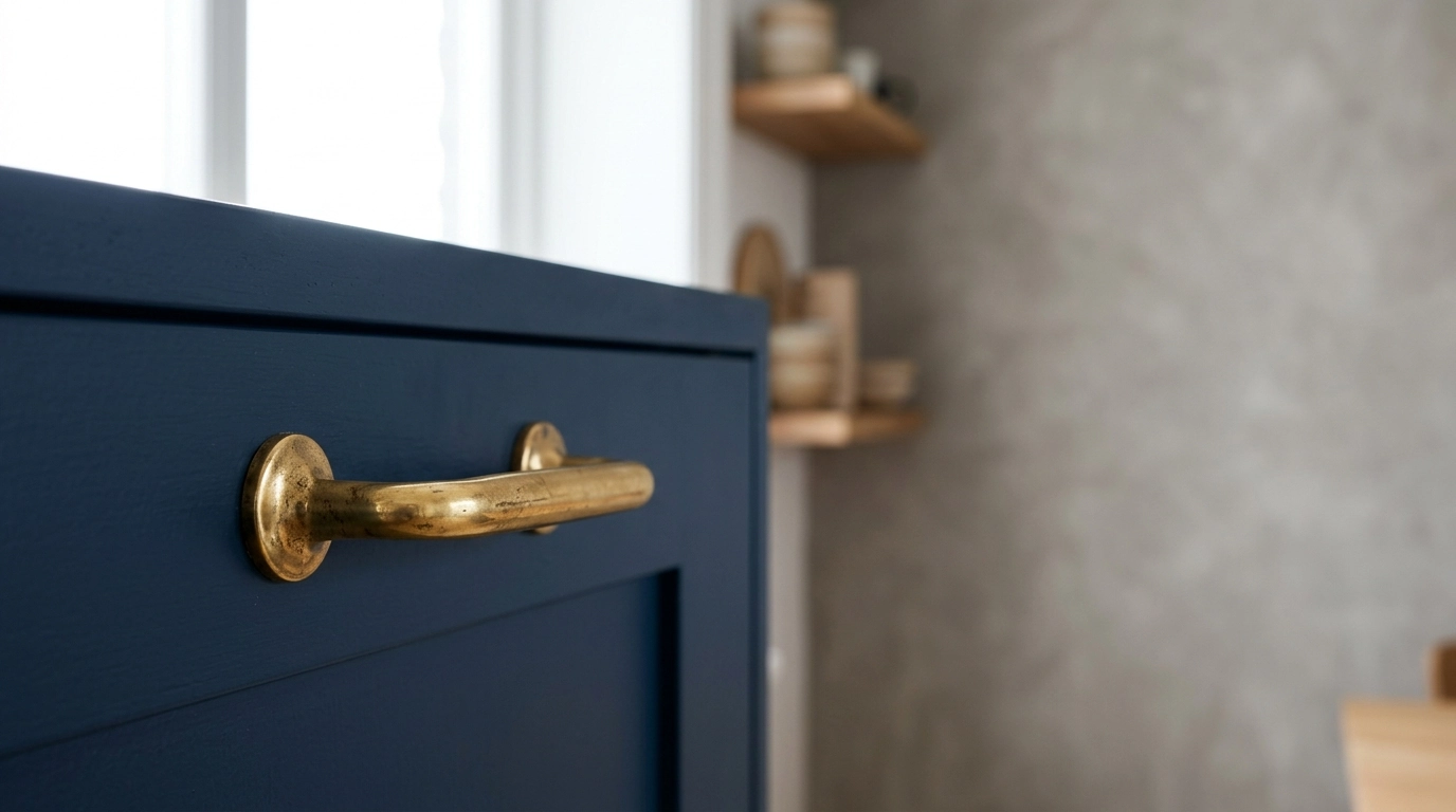
What color compliments brass?
Brass looks best when it’s paired with colors that either calm down its warmth or intentionally amplify it. In most homes, the easiest, most reliable compliments for brass are soft whites, deep blues, and grounded greens. Those shades let brass read as intentional and elevated instead of overly shiny or yellow.
Best color matches for brass hardware and fixtures
Crisp white and warm ivory are the safest pairings for brass. White keeps the finish looking clean and modern, while ivory leans more classic and vintage. If you’re choosing paint, tile, or a sink color, both options make brass feel bright without competing for attention.
Navy and deep blue are standout compliments for brass because they create high contrast. Brass brings warmth; blue brings depth. This combo works especially well for vanities, lower cabinets, accent walls, or textiles where you want the brass to pop.
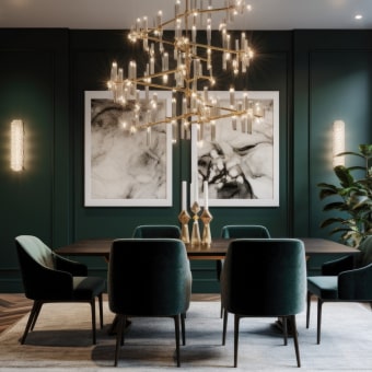
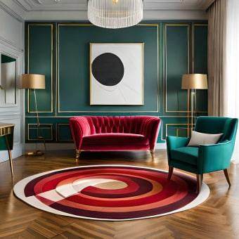
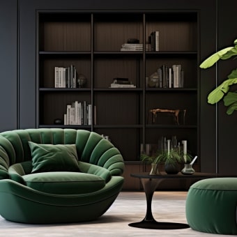
Sage, olive, and forest green flatter brass by echoing the earthy side of the metal. These greens read calm and designer-forward, especially in bathrooms and kitchens where brass faucets or handles are the focal point.
Charcoal and matte black can make brass feel sharper and more contemporary. If you’re mixing finishes, keep black elements consistent (lighting, mirror frames, or cabinet pulls) so the brass feels like a purposeful highlight rather than a mismatch.
Quick guidance for choosing the right pairing
If your brass finish is more antique or brushed, it pairs beautifully with warmer neutrals, creamy whites, and natural textures like wood or stone. If your brass is brighter or polished, balance it with cooler shades like navy, crisp white, or slate to keep the look refined.
Putting together a bathroom upgrade? Our team walks through a luxe combination—ceramic sink styling with an antique brass faucet—here: https://bestsellis.com/guide-round-ceramic-sink-antique-brass-faucet-luxe-upgrade/.
FAQ
Does brushed nickel go with brass?
Yes—brushed nickel can pair well with brass when you keep one finish dominant and use the other as a secondary accent. Repeat each finish at least twice (for example, faucet and mirror) so the mix looks intentional.
Recommended for you

Should Your Faucet Match Your Sink? Design Rules
Oct 13, 2026








Leave a comment