-
Shop
- Advanced Technologies
- AI Skills
- Bathroom
- Best-Sellers
- Car Accessories
- Confidence
- Dating & Social Skills
- Digital Resources
- AI & Technology
- Beauty
- Budgeting & Saving
- Car Buying & Ownership
- Cozy Feast Collection
- Electronics & Technology
- Entrepreneurship & Business Growth
- Financial Education
- Financial Independence
- Financial Mindset & Psychology
- Goal Setting
- Home Styling & Organization
- Kitchen & Recipes
- Leadership
- Mindfulness
- Mindset
- Online Business
- Parenting & Child Development
- Personal Style & Fashion
- Pet Lifestyle & Wellness
- Positive Thinking
- Sleep Improvement
- Smart Life with AI
- Stress Management & Relaxation
- Travel Planning
- Wellness
- Yoga & Fitness
- Yoga & Mind-Body Practices
- Education & Learning
- Family & Parenting
- Fashion
- Accessories
- Alexander McQueen
- Bags
- Bags & Wallets
- Balenciaga
- Belts
- Blazers
- Bottega Veneta
- Bottoms
- Brunello Cucinelli
- Burberry
- Chanel
- Chloé
- Dior
- Dolce & Gabbana
- Dresses
- Etro
- Fendi
- Gucci
- Hats & Hair Accessories
- Hoodies & Sweatshirts
- Jacquemus
- Jewelry
- Jil Sander
- Kiton
- Luggage
- Miu Miu
- Off-White
- Outerwear
- Prada
- Rick Owens
- Saint Laurent
- Shoes
- Socks & Tights
- Sweaters & Cardigans
- The Row
- Tom Ford
- Tops & Shirts
- Valentino
- Valentino Garavani
- Versace
- Vivienne Westwood
- Watches
- Fashion Accessories
- Furniture
- Gadgets
- Health & Beauty
- Health & Wellness
- Home & Garden
- Home Decor
- Home Electronics
- Home Supplies
- Kids & Babies
- Kitchen
- Kitchen Best-Sellers
- Lighting
- Patio, Lawn & Garden
- Personal Growth
- Pet Care
- Pet Supplies
- Pets
- Sport & Outdoors
- Super Deals
- Travel
- Travel & Adventure
- Wealth
- Popular
- Best deals
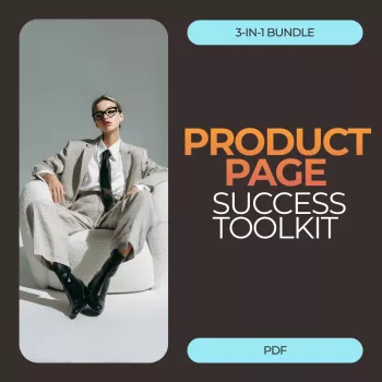
High-Converting Landing Page Blueprint: 6 Steps

How to build a high-converting landing page
A high-converting landing page is built around a single decision: click, sign up, or buy. Every section should reduce uncertainty and friction while making the next step feel obvious. Start by matching the page to the traffic source—your headline and first screen should mirror the promise made in the ad, email, or social post so visitors instantly feel they’re in the right place.
1) Lead with a clear value proposition
Use a specific headline that names the outcome and who it’s for, followed by a short subhead that clarifies how you deliver it. Avoid vague hype. If the offer saves time, reduces costs, or improves results, say so plainly and quantify when possible.
2) Build a first screen that answers “What do I do next?”
Place one primary call-to-action (CTA) above the fold with benefit-focused button text (e.g., “Get the Bundle” or “Start Free Trial”). Keep navigation minimal or remove it when appropriate, so attention stays on the conversion path.
3) Use a simple, persuasive page flow
After the hero section, guide visitors through: key benefits, how it works, proof, then the offer and CTA again. Use short sections, scannable headings, and bullets. Each section should earn the next scroll by resolving a doubt (fit, features, results, risk).
4) Add proof and risk reducers where hesitation happens
Include testimonials, ratings, logos, before/after results, or mini case studies near the CTA and near pricing. Add guarantees, returns, security badges, and clear shipping or delivery expectations. If the form is long, explain why you need each field or reduce it.
5) Make the offer easy to evaluate
Spell out what’s included, who it’s for, and what success looks like. If you have tiers, visually highlight the recommended option and keep differences obvious. Use tight, specific microcopy around pricing and checkout to prevent last-second drop-offs.
6) Test what matters
Prioritize experiments on headline, CTA, offer framing, and proof—these usually beat cosmetic changes. Track scroll depth, click-through, and form abandonment to pinpoint where motivation drops.
For a deeper, step-by-step framework and practical templates, visit the full guide: https://bestsellis.com/guide-product-page-success-toolkit-3-in-1-conversion-bundle/.
FAQ
What elements should you A/B test first on a landing page?
Start with the headline, primary CTA (text, placement, and color contrast), the core offer (pricing, bonuses, guarantees), and proof near the CTA. These elements directly affect whether visitors understand the value and feel confident taking action.


Leave a comment