-
Shop
- Advanced Technologies
- AI Skills
- Bathroom
- Best-Sellers
- Car Accessories
- Confidence
- Dating & Social Skills
- Digital Resources
- AI & Technology
- Beauty
- Budgeting & Saving
- Car Buying & Ownership
- Cozy Feast Collection
- Electronics & Technology
- Entrepreneurship & Business Growth
- Financial Education
- Financial Independence
- Financial Mindset & Psychology
- Goal Setting
- Home Styling & Organization
- Kitchen & Recipes
- Leadership
- Mindfulness
- Mindset
- Online Business
- Parenting & Child Development
- Personal Style & Fashion
- Pet Lifestyle & Wellness
- Positive Thinking
- Sleep Improvement
- Smart Life with AI
- Stress Management & Relaxation
- Travel Planning
- Wellness
- Yoga & Fitness
- Yoga & Mind-Body Practices
- Education & Learning
- Family & Parenting
- Fashion
- Accessories
- Alexander McQueen
- Bags
- Bags & Wallets
- Balenciaga
- Belts
- Blazers
- Bottega Veneta
- Bottoms
- Brunello Cucinelli
- Burberry
- Chanel
- Chloé
- Dior
- Dolce & Gabbana
- Dresses
- Etro
- Fendi
- Gucci
- Hats & Hair Accessories
- Hoodies & Sweatshirts
- Jacquemus
- Jewelry
- Jil Sander
- Kiton
- Luggage
- Miu Miu
- Off-White
- Outerwear
- Prada
- Rick Owens
- Saint Laurent
- Shoes
- Socks & Tights
- Sweaters & Cardigans
- The Row
- Tom Ford
- Tops & Shirts
- Valentino
- Valentino Garavani
- Versace
- Vivienne Westwood
- Watches
- Fashion Accessories
- Furniture
- Gadgets
- Health & Beauty
- Health & Wellness
- Home & Garden
- Home Decor
- Home Electronics
- Home Supplies
- Kids & Babies
- Kitchen
- Kitchen Best-Sellers
- Lighting
- Patio, Lawn & Garden
- Personal Growth
- Pet Care
- Pet Supplies
- Pets
- Sport & Outdoors
- Super Deals
- Travel
- Travel & Adventure
- Wealth
- Popular
- Best deals
Spring Shades Guide: Color Confidence, Easy Outfits
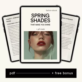
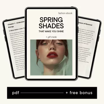
Spring Shades That Make You Shine: A Digital Guide to Color Confidence (and a Wardrobe That Feels Effortless)
Spring style feels easier when color does the heavy lifting. The right shades brighten your skin tone, make outfits look intentional, and help you get dressed faster—without buying a whole new closet. Our team created “Spring Shades That Make You Shine” to help you choose flattering spring colors, combine them with confidence, and translate those choices into a wearable wardrobe that still feels like you.
Why spring color choices feel tricky (and how to simplify them)
Spring color gets mislabeled as “pastels only,” but what actually reads fresh is clarity: warm-to-neutral tones, clean contrast, and saturation that looks lively rather than loud. When a shade is right for you, even simple basics (tee + jeans, tank + skirt, knit + trousers) land as polished instead of accidental.
Most closet frustration comes from mismatch: colors that fight each other, your undertone, or your lifestyle. A clear color plan reduces decision fatigue, cuts down “almost right” outfits, and helps you shop with purpose instead of panic.
If you want a quick primer on how color works, we like the foundations from Color Matters: Color Theory Basics and seasonal color direction from the Pantone Color Institute.
What’s inside the “Spring Shades That Make You Shine” digital download
Our guide is built around wearability. You’ll get a practical framework for picking spring shades that make your features look energized—without feeling like you’re dressing in costume.
- A simple method to choose shades that look bright on you, not overpowering.
- A cohesive palette structure: hero colors (head-turners), support colors (harmonizers), and neutrals (anchors).
- Styling prompts that turn color ideas into outfits: pairing logic, contrast levels, and repeatable formulas.
- A wardrobe-friendly approach that starts with what you already own, then fills gaps with intention.
You can grab the download here: Spring Shades That Make You Shine – Digital Download Guide for Color Confidence & Stylish Spring Wardrobe.
The “shine” test: choosing shades that flatter fast
When you’re short on time, the goal is to identify colors that make your complexion look rested and your outfits look cohesive. Here’s the fast track our team uses:
- Start with your best neutrals. These are the neutrals that never wash you out. They become your palette base.
- Pick 2–3 hero shades. Choose brights that energize your look without drowning your features.
- Add 2–3 accents. Think soft-to-medium tones that blend with your neutrals and keep outfits from feeling “too much.”
- Adjust, don’t quit. If you love a color but it feels off, tweak saturation (softer vs. stronger) or temperature (warmer vs. cooler).
- Make it repeatable. Each hero shade should pair with at least two neutrals and one other color.
Quick Pairing Table: Spring Shade + Neutral Anchor + Best Use
| Spring shade | Neutral to anchor it | Easy outfit idea | Where it shines |
|---|---|---|---|
| Warm coral | Cream or light camel | Coral top + cream jeans + tan sandals | Brunch, daytime events |
| Fresh mint | Soft white or light gray | Mint knit + white denim + silver jewelry | Casual office, weekends |
| Sunny yellow | Navy or medium denim | Yellow tee + denim jacket + white sneakers | Travel, errands, outdoors |
| Peach | Taupe or warm beige | Peach blouse + taupe trousers + gold hoops | Work, dinners |
| Aqua | Crisp white or sand | Aqua dress + white sneakers + straw bag | Day trips, warm-weather parties |
| Apple green | Chocolate brown or stone | Green cardigan + stone tank + brown belt | Layering season, casual meetings |
Turning color confidence into a stylish spring wardrobe
Once your palette is clear, getting dressed becomes a simple assembly process. We recommend a 3-part structure that keeps outfits colorful but controlled: 60% neutrals, 25% hero shades, and 15% accents. That ratio prevents color from feeling chaotic while still giving you that spring “lift.”
- Build repeatable outfit formulas. Try: top + bottom + third piece; dress + layer; matching set + contrast accessory.
- Keep prints on a leash. Choose prints that include at least one of your neutrals and one hero shade, so every patterned piece earns its spot.
- Match color to comfort level. Start with accessories, then tops, then statement pieces as you gain confidence.
- Lock in your wins. Photograph 8–12 go-to outfits on your phone so you can rotate them quickly on busy mornings.
How to use the download in 20 minutes (a routine that sticks)
This is designed to fit into real life. Here’s a quick setup you can do in one sitting:
- Step 1 (5 minutes): Identify three neutrals you already wear well—use them as your spring anchors.
- Step 2 (7 minutes): Choose two hero shades and two accents that pair with those neutrals.
- Step 3 (5 minutes): Create three outfit templates you can repeat (casual, work, going out).
- Step 4 (3 minutes): Make a tiny gap list only if needed: one layer, one shoe, one top in a hero shade.
Because it’s a digital download, you can keep your palette and outfit templates saved on your phone and reference them while you shop or pack.
Extra tools we keep in our digital drawer
- AI for Small Business Toolkit – 5-in-1 Digital Download Bundle
- Choosing the Right Payment Solution for Your Business: Stripe vs Square Which Is Better – Complete eBook Guide for Small Business Owners
FAQ
How do I make my own shades?
Start with a base color you already like, then test versions that are lighter/darker and warmer/cooler until your complexion looks brighter and more even. Build a mini palette with your best neutrals plus 2 hero shades and 2 accents, choosing versions that pair easily with your existing basics.
Who makes the best shades?
The best shades are the ones that brighten your complexion, work with the neutrals you actually wear, and fit your day-to-day life. Instead of chasing one-size-fits-all trends, use a consistent palette so every new piece has clear outfit partners.
Recommended for you


Best Clear Coat for Outdoor Metal Art: Top Picks
Oct 11, 2026
Round Smart Nightstands for Calm Nordic Bedrooms
Oct 11, 2026










Leave a comment